COLORS -
Across the top of the palette:
Down the left of the palette:
Across the bottom of the palette:
|
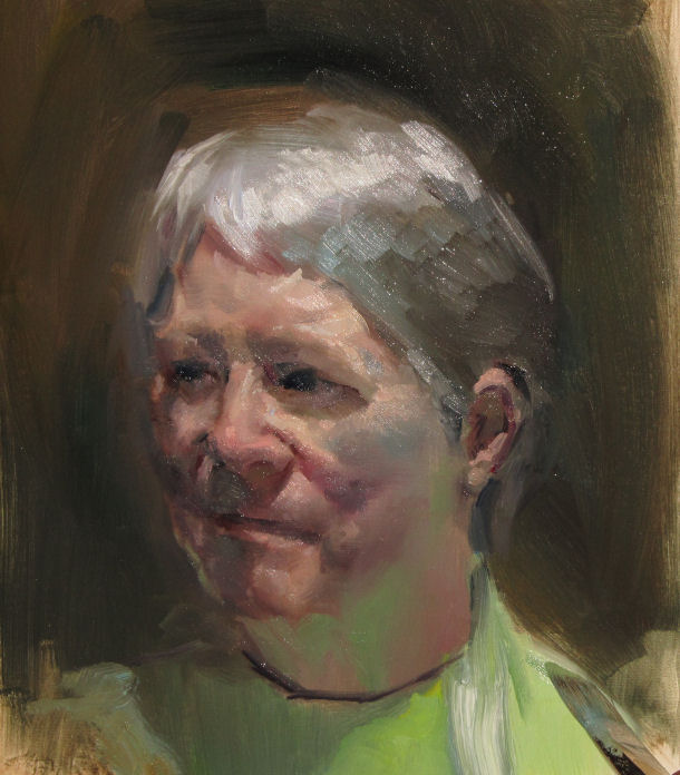
Wilson grew up in the San Francisco Bay Area and went to Brigham Young University, receiving a B.F.A in painting and drawing. He furthered his studies at the Art Students’ League in New York City, NY studying with nationally renowned figurative artists Ted Seth Jacobs and Harvey Dinnerstein. In addition to his professional art, Wilson was a full-time art instructor and department chair for nine years at the Waterford School in Sandy, UT. His students garnered numerous national and in state awards during that time. When time alots Wilson teaches workshops for large to small groups. He presently resides with his family in Corning, New York pursuing his art full time. /\/\/\/\/\/\/\/\/\/\/\/\/\/\/\/\/\/\/\/\/\/\/\/\/\/\/\/\/\/\/\/\/\/\/\/\/\/\/\/\/\/\/\/\/\/\/\/\/\/\/\/\/\/\/\/\/\/\/\/\/ On October 8th, 2011, Wilson chose to do a portrait demo in the morning of our own Delores Morgan.
SETTING UP THE MODEL - A comfortable pose with a good light to bring out some good contrasts. PAPER - Wilson uses archival paper (acid free) sealed on the front and back with Gesso. (Most of his supplies come from the Utrech company and Jerry's art supplies) PAINTS - Today's paints are of better quality than in the past, but it is best to use paints with good tinting strength. Professional grades have the highest tinting strength (more color/less medium). MEDIUM - Wilson coats his paper with LIQUIN to help the paint spread more smoothly and dry faster on the paper. Instead of dipping his brushes in turpentine to clean them, he WIPES off his brush before picking up more or a new color, thus he does not dilute his paint.
|
:
|
|
|||
 |
BLOCKING IN THE FIGURE -
Wilson blocks in the the basic form and features (the skeleton and shadows) with a mixture of saved left over paint (basically yellow ochre, ultramarine blue and burnt sienna). It is important to break down the light and shadow areas. When starting with portraits use 2 colors, or one color and rub our the light areas. (A Grisaille is when the painting is painted with just black and white. Focus on VALUE rather than temperature at first. PROPORTIONS AND MEASUREMENTS - Make sure you double check proportions. Nose to top of head... Nose to chin.... Nose to ears. Do not draw the nostrils first. Put values down first, then reflected light under nose. After proportion is correct, you can go into details. Start with nose.
|
|||||
 |
FLESH COLOR- this can have many different elements: (Light : - Burnt Sienna + White + Alizarin Crimson) It will not look pinkish because it was blocked in neutral colors. (Shadow: - Alizarin + Ultramarine + Burnt Umber) You want translucency as much as possible by putting cool colors first then tints or warmer colors. Add reflected light and highlights after putting down basic colors. (Highlights show the physical positioning of light source.) DAY 2 - If the paint dries too much in the next painting session: you can put a thin coat of Liquin, then match the original color first, then add the new color or highlight. |
|||||
 |
 |
|||||
 |
 |
|||||
 |
 |
|||||
 |
 |
|||||


